
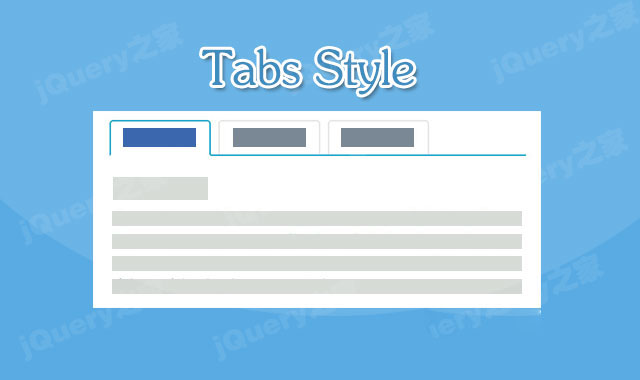
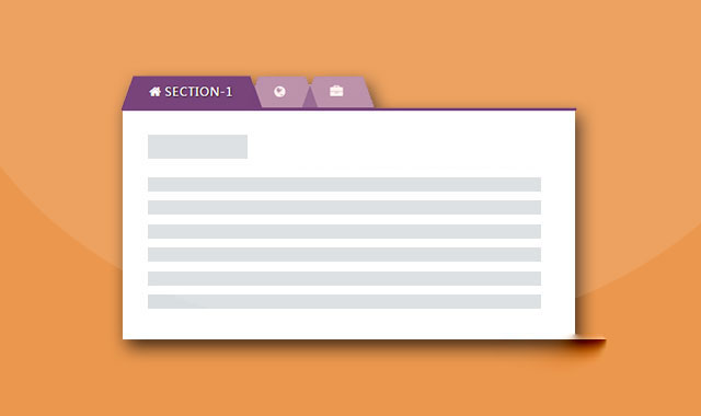
这是一款非常简单的Bootstrap Tabs选项卡美化特效。该特效在原生Bootstrap Tabs选项卡的基础上,通过css3来对它进行了一些美化效果。
使用方法
在页面中引入jquery和bootstrap相关文件。
HTML结构
该Bootstrap Tabs选项卡使用下面的HTML结构:
选项卡 1
....
选项卡 2
...
选项卡 3
....
CSS样式
通过下面的CSS代码来对选项卡进行美化。
a:hover,a:focus{
    outline: none;
    text-decoration: none;
}
.tab .nav-tabs{
    position: relative;
    border-bottom: none;
}
.tab .nav-tabs li{
    text-align: center;
    margin-right: 10px;
}
.tab .nav-tabs li a{
    display: block;
    font-size: 16px;
    font-weight: 600;
    color: #444;
    padding: 10px 15px;
    background: transparent;
    margin-right: 0;
    border: none;
    border-radius: 0;
    overflow: hidden;
    position: relative;
    z-index: 1;
    transition: all 0.5s ease 0s;
}
.tab .nav-tabs li a:before{
    content: "";
    width: 100%;
    height: 3px;
    background: #de7921;
    position: absolute;
    top: 92%;
    left: 0;
    transition: all 0.3s ease 0s;
}
.tab .nav-tabs li a:hover:before,
.tab .nav-tabs li.active a:before,
.tab .nav-tabs li.active a:hover:before{
    top: 0;
}
.tab .nav-tabs li a:after{
    content: "";
    width: 100%;
    height: 100%;
    background: #fff;
    position: absolute;
    top: 100%;
    left: 0;
    z-index: -1;
    transition: all 0.3s ease 0s;
}
.tab .nav-tabs li a:hover:after,
.tab .nav-tabs li.active a:after,
.tab .nav-tabs li.active a:hover:after{
    top: 0;
}
.nav-tabs li.active a,
.nav-tabs li.active a:focus,
.nav-tabs li.active a:hover,
.nav-tabs li a:hover{
    border: none;
}
.tab .tab-content{
    padding: 30px 15px 20px;
    background: #fff;
    font-size: 14px;
    color: #555;
    line-height: 26px;
}
.tab .tab-content h3{
    font-size: 24px;
    margin-top: 0;
}
@media only screen and (max-width: 479px){
    .tab .nav-tabs li{ width: 100%; }
}


 粤公网安备 44011102002787号