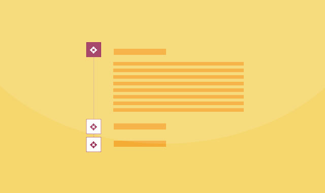
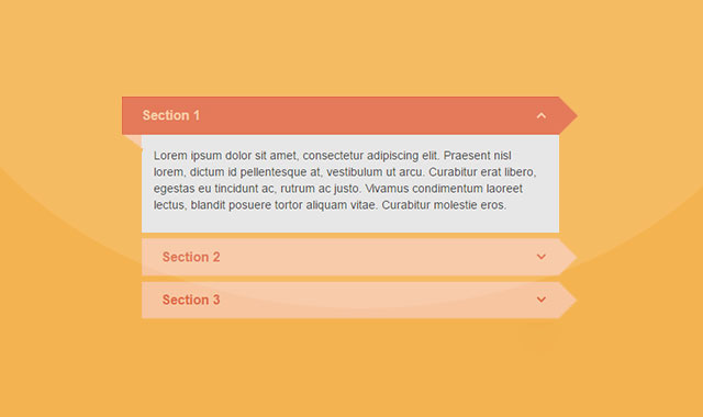
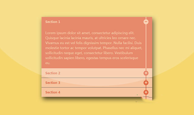
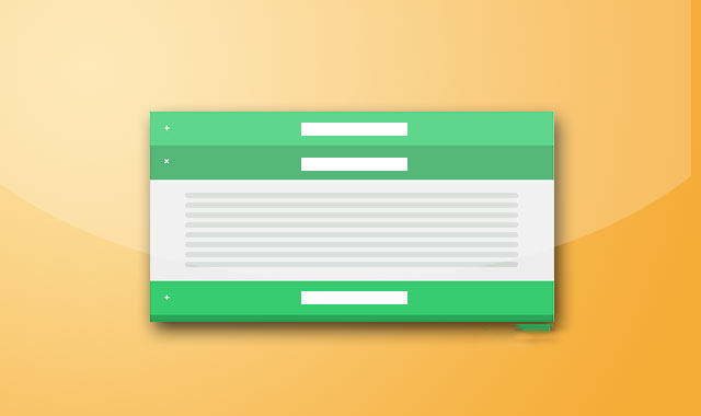
这是一款基于Bootstap的超酷CSS3垂直手风琴列表效果。该CSS3垂直手风琴列表在元素Bootstap的基础上,添加了自定义的样式,使手风琴的效果更加好看。
使用方法
在页面中引入jquery和bootstrap相关文件,以及font-awesome字体图标文件。
HTML结构
该垂直手风琴列表的HTML结构如下:
HTML结构
为该垂直手风琴列表添加如下的CSS样式:
a:hover,a:focus{
    text-decoration: none;
    outline: none;
}
#accordion{
    padding-left: 76px;
    overflow: hidden;
    position: relative;
    z-index: 1;
}
#accordion:before{
    content: "";
    width: 1px;
    height: 90%;
    background: #9d325b;
    position: absolute;
    top: 0;
    left: 22px;
    z-index: -1;
}
#accordion .panel{
    border: none;
    box-shadow: none;
    border-radius: 0;
}
#accordion .panel-heading{
    padding: 0;
    border-radius: 0;
    border: none;
}
#accordion .panel-title a{
    display: block;
    font-size: 16px;
    font-weight: bold;
    color: #31162e;
    padding: 10px 30px 15px 0;
    background: #fff;
    position: relative;
    transition: all 0.5s ease 0s;
}
#accordion .panel-title a:before{
    content: "\f05b";
    font-family: fontawesome;
    font-size: 20px;
    color: #fff;
    width: 40px;
    height: 40px;
    line-height: 40px;
    text-align: center;
    background: #9d325b;
    border: 1px solid #9d325b;
    position: absolute;
    top: 0;
    left: -74px;
}
#accordion .panel-title a.collapsed:before{
    color: #9c335b;
    background: #fff;
}
#accordion .panel-body{
    font-size: 14px;
    color: #487677;
    line-height: 25px;
    padding: 5px 15px 15px 0;
    border: none;
}
上一篇:
纯css3内容滑块手风琴效果


 粤公网安备 44011102002787号