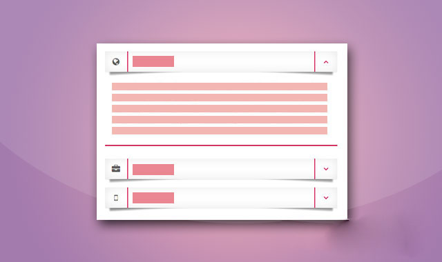
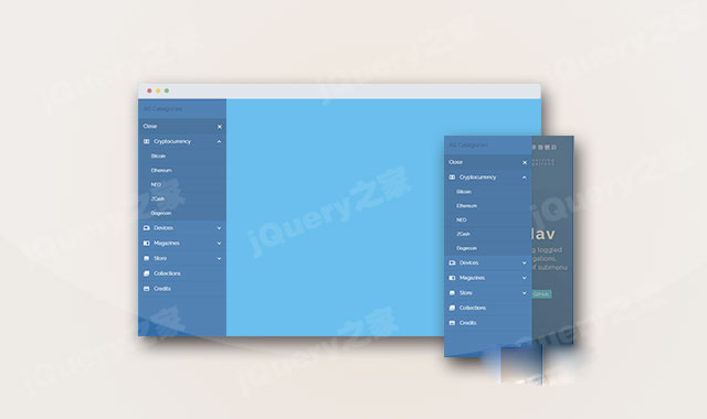
这是一款效果非常炫酷的Bootstrap垂直手风琴折叠菜单特效。在该bootstrap垂直手风琴折叠菜单中,每个菜单项通过css3阴影制作出带立体感觉的纸张效果,非常炫酷。
使用方法
在页面中引入jquery和bootstrap相关文件,以及fontawsome字体图标文件。。
HTML结构
该Bootstrap垂直手风琴折叠菜单的HTML结构如下。
CSS样式
然后为该Bootstrap垂直手风琴折叠菜单添加下面的CSS样式,对其进行美化。
a:hover,a:focus{ text-decoration: none; outline: none; } #accordion .panel{ border: none; border-radius: 0; box-shadow: none; margin: 0 0 10px; overflow: hidden; position: relative; } #accordion .panel-heading{ padding: 0; border: none; border-radius: 0; margin-bottom: 10px; z-index: 1; position: relative; } #accordion .panel-heading:before, #accordion .panel-heading:after{ content: ""; width: 50%; height: 20%; box-shadow: 0 15px 5px rgba(0, 0, 0, 0.4); position: absolute; bottom: 15px; left: 10px; transform: rotate(-3deg); z-index: -1; } #accordion .panel-heading:after{ left: auto; right: 10px; transform: rotate(3deg); } #accordion .panel-title a{ display: block; padding: 15px 70px 15px 70px; margin: 0; background: #fff; font-size: 18px; font-weight: 700; letter-spacing: 1px; color: #d11149; border-radius: 0; box-shadow: 0 1px 4px rgba(0, 0, 0, 0.1), 0 0 40px rgba(0, 0, 0, 0.1) inset; position: relative; } #accordion .panel-title a:before, #accordion .panel-title a.collapsed:before{ content: "\f106"; font-family: fontawesome; width: 55px; height: 100%; text-align: center; line-height: 50px; border-left: 2px solid #D11149; position: absolute; top: 0; right: 0; } #accordion .panel-title a.collapsed:before{ content: "\f107"; } #accordion .panel-title a .icon{ display: inline-block; width: 55px; height: 100%; border-right: 2px solid #d11149; font-size: 20px; color: rgba(0,0,0,0.7); line-height: 50px; text-align: center; position: absolute; top: 0; left: 0; } #accordion .panel-body{ padding: 10px 20px; margin: 0 0 20px; border-bottom: 3px solid #d11149; border-top: none; background: #fff; font-size: 15px; color: #333; line-height: 27px; }


 粤公网安备 44011102002787号