
这是一款Bootstrap popover功能扩展jquery插件。该jquery插件在原生Bootstrap popover功能的基础上,添加了一些新的功能,例如自动定位,支持情景模式等。
使用方法
在页面中引入jquery和bootstrap相关文件,以及bootstrap-popover-x.css和bootstrap-popover-x.js文件。
HTML结构
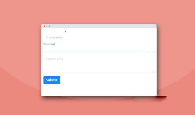
一个Bootstrap Popover的基本HTML结构如下:
× Title here
Popover content goes here
然后可以通过一个按钮来触发Popover。
插件为Popover内置了6种情景模式。
- popover-default
- popover-primary
- popover-info
- popover-success
- popover-danger
- popover-warning
...
你还可以指定Popover出现的位置。
- right
- left
- top
- bottom
- top top-left
- top top-right
- bottom bottom-left
- bottom bottom-right
- left left-top
- left left-bottom
- right right-top
- right right-bottom
- auto
- auto-top
- auto-right
- auto-bottom
- auto-left
- horizontal
- vertical
最后还可以指定鼠标hover或聚焦按钮是打开Bootstrap Popover。
初始化插件
也可以通过js代码来初始化Bootstrap Popover。
<-- 例如下面的按钮使用上面相同的popover内容标签 -->
该Bootstrap popover功能扩展jquery插件的github地址为:https://github.com/kartik-v/bootstrap-popover-x


 粤公网安备 44011102002787号